Most small business websites bury the most important information.
Not on purpose. It just happens. You’re so deep into what you do that you forget the person landing on your homepage has no idea who you are. So you lead with your company name, a tagline that sounds meaningful to you, and a photo. Then somewhere in the third paragraph — after the mission statement and the list of services — you finally say what you actually do.
By then most people are already gone.
The five-second test
When someone lands on your homepage, they’re asking three questions immediately. What does this business do? Is it for me? Can I trust them?
If your page doesn’t answer all three in the first few seconds, they leave. Not because they’re impatient. Because there are ten other options and their time is short.
Try it yourself. Pull up your homepage and look away for a moment. Then look back and time how long it takes to find a plain-English answer to “what do they do and who is it for.” If it takes more than five seconds, that’s the problem.
What this actually costs you
This isn’t a design problem. A slow site costs you ranking. A broken contact form costs you leads. But a homepage that doesn’t say what you do costs you everyone who wasn’t already looking specifically for you — which is most of the people who could become customers.
The business down the street with a worse-looking site but a clear first sentence will win that visitor every time.
What the fix looks like
It’s one sentence. That’s usually it.
Not a tagline. Not a slogan. A plain description of what you do, where you do it, and who it’s for.
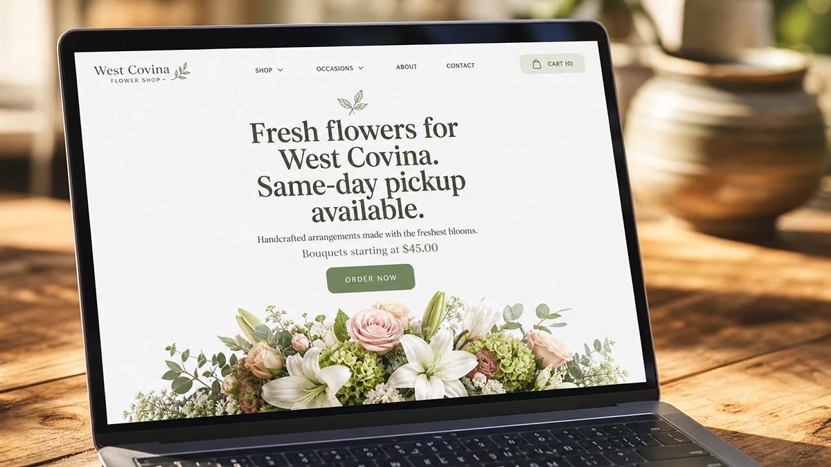
“We do commercial cleaning for offices and warehouses in the Pomona Valley.”
“Tax prep for small business owners in the SGV. Open year-round.”
“Custom screen printing for events, teams, and small businesses. Minimum 12 pieces.”
None of those are pretty. All of them are immediately clear. Clarity wins over clever every time.
That sentence goes at the top of the page. Above the fold, before anything else. Then you can have the photo and the mission statement and all the rest of it.
The second problem
Once people understand what you do, they need to know they’re in the right place.
Most small business websites try to speak to everyone. The copy is vague enough to apply to any customer. That feels safe, but it reads as nothing. When someone who fits your actual customer profile lands on a generic page, they don’t see themselves in it. They move on.
The businesses that convert well are specific. They name the customer. They say the thing their best customers already think. They make the right person feel like the page was written for them — because it was.
One thing to do today
Open your homepage. Read the first three sentences out loud.
If a stranger couldn’t tell what you do and who you serve from those three sentences alone, rewrite them before you do anything else. Not the logo, not the colors, not the font. The words.
That’s where the money is.
Need someone to look at your site and tell you what’s actually wrong with it? That’s something I do. Book a free 30-minute chat.